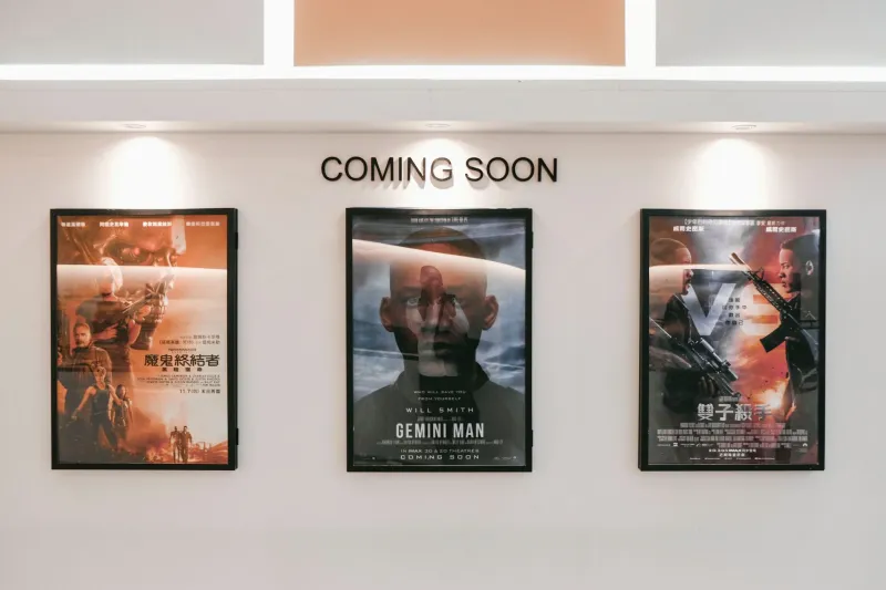
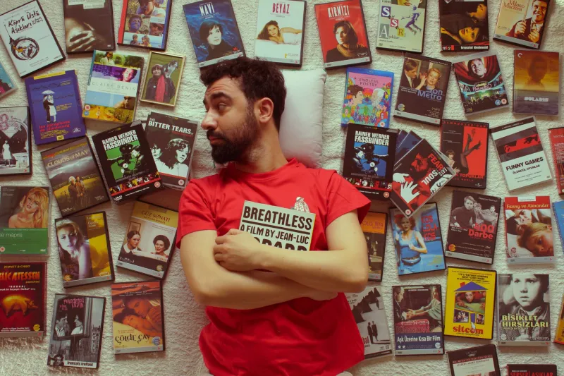
Masterpiece Film, Dumpster Fire Poster: The Baffling Gap Between Great Movies and Their Terrible Key Art

Imagine spending three years of your life crafting a film that goes on to win a Sundance award, earn a 97% on Rotten Tomatoes, and make grown adults cry in a Cinemark parking lot. Now imagine that film's poster is just... a slightly blurry photo of the lead actor staring into the middle distance with the title in Impact font.
Welcome to the Poster Paradox — the strange, deeply unfair phenomenon where extraordinary movies get the most aggressively ordinary marketing materials imaginable. It happens more than you think. It happens more than the industry wants to admit. And honestly? It's become one of the most fascinating fault lines in all of pop culture.
The Usual Suspects: What Actually Goes Wrong
Before we name names (don't worry, we're going to name names), it helps to understand why great films end up with posters that look like they were assembled during a lunch break using a stock photo subscription and a vague memory of what the movie was about.
The culprits are almost always the same three: budget constraints, studio interference, and the tyranny of the timeline.
Independent films, despite their critical prestige, frequently operate on marketing budgets that would make a mid-tier YouTube channel blush. A distributor picking up a buzzy indie darling at a film festival might love the movie unconditionally — and then hand the poster work to whoever is cheapest and fastest. The result is key art that communicates nothing except "this is a movie that exists."
Studio interference, meanwhile, is the great equalizer of bad taste. Even prestige productions with healthy budgets can get absolutely steamrolled by a committee of executives who've decided, based on absolutely no evidence, that audiences will only buy tickets if the poster features the star's face at 400% zoom. Designers who've worked on major campaigns describe the process as "death by a thousand revision requests," where every bold creative choice gets sanded down until what remains is something deeply, profoundly safe.
And then there's the clock. Theatrical release windows don't move for anyone. Posters have been known to get finalized in seventy-two-hour sprints because the film got acquired late, the release date got moved up, or someone in marketing simply forgot to start the process until it was almost too late.
Case Study: The Indie Darlings Who Got Robbed
Let's talk about Beasts of the Southern Wild (2012). Quvenzhané Wallis delivered one of the most electrifying child performances in American cinema history. The film was nominated for four Academy Awards, including Best Picture. The theatrical poster? A slightly washed-out image of Wallis sitting on what appears to be a log, with moody blue tones and text that tells you almost nothing about the wild, thunderous emotional experience waiting inside.
Or consider A Ghost Story (2017), David Lowery's haunting meditation on grief, time, and the stubborn persistence of love. The film is visually stunning — a ghost in a bedsheet wandering through the centuries is genuinely iconic imagery. And yet multiple versions of the marketing leaned so hard into the horror-adjacent aesthetic that casual moviegoers assumed it was a Halloween thriller rather than one of the most quietly devastating films of the decade.
Then there's Moonlight (2016), which eventually won Best Picture in the most chaotic Oscar ceremony moment in living memory. The film's poster — a triptych of the main character at three stages of life — was actually pretty good. But early promotional materials were so muted and deliberately obscure that many audiences had no idea what the film was about until word of mouth did the heavy lifting the poster refused to do.
"We Fought for It" — Designers on the Constraints They Never Talk About
Speak to any working theatrical poster designer off the record and they'll tell you the same thing: the poster you see in the lobby is rarely the poster anyone wanted to make.
"You come in with these incredible concepts," one veteran designer explained. "Something that actually reflects the tone, the texture, the soul of the film. And then you get notes. 'Can we make the title bigger?' 'Can we see more of the actor's face?' 'The director loves it but the distributor wants something more commercial.' By the fifth round of revisions, you barely recognize what you started with."
The constraints are especially brutal for prestige dramas and indie films, where the subject matter is often challenging, the visual language is unconventional, and the marketing team is simultaneously trying to appeal to arthouse audiences and convince mainstream moviegoers to take a chance. It's an impossible brief, and the poster usually pays the price.
The Float-Face Epidemic
If you've spent any time playing Posterdle — staring at cropped, zoomed, and partially revealed movie posters trying to identify the film — you've definitely encountered what the design community has affectionately (and furiously) dubbed the "floating heads" problem.
Somewhere in the 1990s, Hollywood collectively decided that the safest possible poster was just the cast's faces, floating against a gradient background, with the title below. This template has been applied to everything from romantic comedies to war epics to films that absolutely, desperately needed something more interesting. The tragedy is that it works — at least commercially. Audiences recognize faces. Faces sell tickets. And so the floating heads persist, even when the film underneath them is doing something genuinely extraordinary.
The paradox deepens when you realize that the movies most hurt by this approach are often the ones that least need the help. A film with incredible word of mouth, a devoted festival following, and critical consensus behind it doesn't need a generic poster — it needs a poster that matches its ambition. Instead, it gets the same visual language as a direct-to-streaming thriller from 2019.
When the Poster Actually Rises to the Occasion
It's worth pausing to celebrate the exceptions, because they exist and they're glorious. Black Swan (2010) had a poster as psychologically fractured as the film itself. Mad Max: Fury Road (2015) used fire, chrome, and chaos in a way that perfectly telegraphed the experience of watching it. Get Out (2017) deployed a tea cup and a single tear to communicate dread more effectively than most horror franchises manage in an entire franchise.
These posters worked because someone — a designer, a director, a marketing exec with actual taste — fought to make them work. They treated the poster as an extension of the film's artistic vision rather than a checkbox on a release schedule.
The gap between those posters and the floating-heads-on-a-gradient disasters isn't talent. It's will, time, and the creative freedom to take a risk.
So What Can Actually Change?
Honestly? Not much, as long as theatrical marketing operates under the same pressures it always has. But there's a growing movement — particularly in the indie and arthouse space — toward commissioning illustrated and hand-designed alternative posters that treat the medium as art. Mondo posters, limited-edition variants, and fan-made alternatives have created an entire parallel economy of movie poster culture that exists specifically because the official version so often disappoints.
In the meantime, the Poster Paradox remains one of cinema's great unsolved mysteries. Somewhere out there, a movie that made you feel genuinely alive is sitting behind a poster that makes it look like a Tuesday night cable filler. And somewhere, a designer is staring at their original concept — the one that captured everything — and wondering what might have been.
At least here at Posterdle, we give every poster its moment in the spotlight. Even the ones that probably don't deserve it.